Same But Different
- Mar 20, 2024
- 2 min read

For media exploration a simple subject is the ticket. Design simply and you're more free to see where you can take it. Or, more accurately, to see where it might take you. It’s the process of putting the design on paper — the materials, colors, techniques — that’s what accesses the imagination.
Try it, see what happens!
Committing to do multiples of the same picture helps me answer the question, where might this go? This week, I did five of the same bird.*
Bird One (above in the sketchbook) — I see color and that tousled, bad boy gaze. A worthy starting point.
Now, Birds Two, Three, and Four. . . . . Time for media play.

Paper — a Strathmore 300 printmaking paper (cut to 6” x 8”) .
Surface preparation — water-soluble oil paint (black then white) rolled on with a brayer.
Pan pastels — light touch over and into the wet paint (sponge applicator), color and value choices, and on/off throughout building the image.
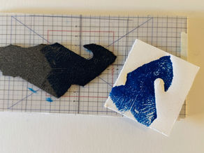
Tools — a razor blade, steel wool and carving tools for ceramics, stencils. Mostly subtractive method to bring out the silhouette and visual textures.
Explore color, texture and mood. Lost and found edges. Depth. Value with colors.

Queue up Bird Five!
Orange card stock, with linen texture. That ought to be challenging.
White water-soluble oil paint over part. Pan pastels, stencils, the same tools as above.
Well, this guy is very far from that tousled, bad boy Bird One.
A playful thing.
_____________
*For a simple subject: I turned to one of my existing models for inspiration — Scout, a wildlife ambassadors for West Sound Wildlife Shelter.

A closer look:
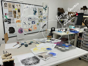
A big part of getting used to the pan pastels is laying them out in the same way each time.
A simple palette — colors arranged by value and warm/cool.


Comments