It Won’t Always be Pretty
- Apr 2, 2024
- 3 min read

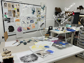
An espresso and a color study — my new morning routine.
To get started, I queue up reference photos from artists I love. The aim is to figure out the color space in the reference photos, how the artist achieved that type of color usage, and to reproduce it.
Pan pastels and a photo reference. One hour.
Week one: here we go.

Start then course correct. I select one of my photos — of leaves. Gentle place to start. The aim is to block in the color — abstract rather than a reproduction of the picture. To see the colors next to each other, how they work together and what speaks to me.
Lesson: Too abstract. Gained a little sense of how to mix these darks, but I wander into random let’s-try this-and-that-and-that territory. 1.5 hrs go by. No finished color study.

Pick a picture I want to understand. This one is by Gary Kelly. Crop in the piece to study —so not an abstract this time, but cropped I automatically put less energy into reproducing the picture.
Lesson: I’m unable to capture Kelly’s bold colors — the pan pastels are too transparent on the white paper. Used stick pastel, smoothed with finger, to get the opaque black. (Kelly uses all stick pastels — the Nupastels, which are harder, chalkier. Now I understand why.) Is there another way I can capture the intensity with pan pastels?

Try a reference that might take the pan pastels better. Hiroshige. Blues and greens.
Lesson: Good lord — my result is so far away from Hiroshige’s beautiful blues and greens. Remember, color studies aren’t about matching every color perfectly or making a pretty picture. . . But come on! I stick it on the wall board and move on for the day.

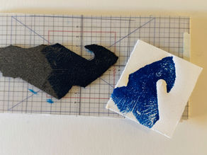
Prepare the paper to let the ground underneath influence the colors I’m after. Return to Hiroshige. With a brayer, roll on black water soluble oil paint, then while still wet, apply the pan pastels on top. Carve away the pastel to leave the black shapes.
Lesson: That’s better. The values of the colors are closer to the reference. Next time, let more/less of the under color (black in this case) show through. The white pan pastel to create a lighter version of the greens and blues — came out just ok. Niggling issue — How to get that light quality of Hiroshige? Is it just on my iPad?

Prepare the paper with white water soluble oil paint. Hiroshige a third time. Pan pastels over the top when wet. Scratch out the moon with steel wool, white pan pastel on top. Sumi-ink goes over the top of everything for darks.
Lesson: Ouch! The colors are too intense. Even when using a darker tone of blues and greens, too much influence from the white. One positive — the moon was bright enough.
The biggest takeaway from week one of color studies? Process — or, more specifically, technique. I need specific ways to work with my pastels to get them to do what I’m after.
I thought I could jump straight to reproducing the color schemes from the photo reference, in the same way I did reproducing value structures. Just substitute pan pastels for charcoal. Pastels are pure pigment — pure color — and mixable. This ought to be relatively straight forward. Well we saw how that turned out.
All this to say that my morning color study will be a little more involved than I thought — and it won’t always be pretty.
A closer look:
Why do color studies at all? Simply to work out how I’ll use color in my work.
How much color do I like to use?
What intensities fit my taste and use?
What limited palettes let me achieve my color goals?
What type of color space do I like to produce — all shifted toward the warm or cool? Analogous, complementary, moody? What do I like if I’m painting solely for myself?
— Questions courtesy of Brent Watkinson, artist and color master


What a fantastic explanation of your sequence of events in this new technique! Thanks for sharing my friend! I so appreciate your tenacity at this.